
How to Create a Neutral Room That's Not Boring

via My Domaine
This post contains affiliate links*. Thanks for supporting this small business in that way!
Turning the calendar to a new year always makes me crave the fresh start that clean, neutral furniture can offer. And while I don’t necessarily want to live in house devoid of color (I’ve got plenty in every room!), I think there’s a lot to learn from neutral spaces. I wanted to share some examples of “neutrals done right” and how you can make a room with a neutral color scheme feel interesting and visually appealing!
So let’s take a look at some gorgeous neutral living rooms and bedrooms I found, and I’ll talk about why they work!
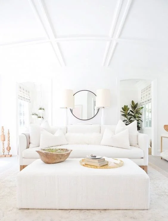
via My Domaine
We’ll kick things off with a white-on-white room - the most neutral of neutrals! It looks deceptively simple, but in reality, this can be challenging to pull off. A pure white room has a way of feeling sterile if you aren’t careful. This living room feels fresh and cozy though, so how did they pull it off?
Why this works: White-on-white rooms need anchor points to give you a sense that the room is grounded and not floating off into the clouds. The main anchor points in this room are the wood base of the sofa frame and the round black mirror above the console table. These pieces add contrast and a spot for your eye to focus. Without them, you’re pretty much left with a white box that doesn’t feel super inviting or comfortable!

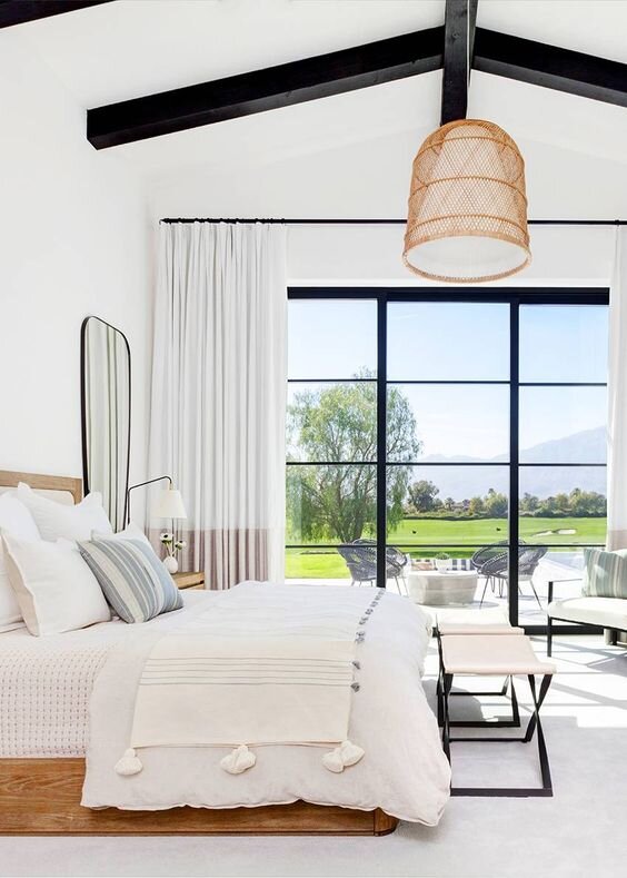
via Lulu & Georgia
Next up, we’ll talk about this bedroom that also pretty much falls into that white-on-white category. It feels a little different though, doesn’t it? The reason - there’s more texture! That’s in addition to the “grounding elements” like the wood base of the swivel chairs in front and the wood canopy bed.
Why this works: Texture adds complexity (in a good way!) and gives a room a more layered and “designed” look. Here you see it in the accent pillows, rugs, chairs, and even the little wood side table. That perfectly imperfect table adds just a touch of contrast and a much needed organic element to this bedroom.

via McGee & Co.
All right! Now let’s start to incorporate a little more “color” - more neutral tones, that is! This living room is a great example of how layering different neutral tones that are similar can create a room that feels calming, cozy, and anything but boring.
Why this works: Not only does this coastal modern living room start to incorporate more variation in color, (which in and of itself adds interest) it also introduces a repeating pattern that draw your eye to different parts of the room. Did you catch it? It’s stripes! You see them all over once you start looking - they’re in the rug, a pillow, the baskets, and even the webbing of the chair frame. Some are subtle and some are more pronounced, but they’re a common element that flows throughout the room to make it feel cohesive without being matchy matchy.

via Amber Interiors
Here’s an example of a living room that has less white in it, but I’d still classify it as very neutral. It leans more into the grays, taupes, and natural woods, which feels super inviting!
Why this works: This one is all about texture and pattern. The more the merrier in this case! Just about every piece here has some sort of texture, pattern, or both. To me, what pulls this room together is the rug - it incorporates pretty much all of the neutral tones you see scattered around the room and it plays the role of grounding the space beautifully. The color palette of the pillows comes right from that rug, and I love the way the structured patterns of those fabrics complement it.
via Studio Life/Style
Goodness, who wouldn’t want to spend lazy mornings in this white bedroom? Sign me up! Even if you’re a color lover, I think we can all appreciate the serene atmosphere a light and bright, neutral bedroom creates, can’t we?
Why this works: In a similar way to the first two images I shared, the keys to this bedroom’s success are two fold: the carefully chosen spots where the designer brought in contrast and the repetition of black throughout. Both of these ground the room and keep it from feeling light it’s floating away. Some of the contrast is obvious (see: bed frame), but there are more subtle forms too, like the color blocked curtain panels or the simple stripes in the textiles.
As for the repetition of black throughout the room, see how many ways they used it - it’s more than you think once you study the photo!
So that’s my take on how to create a neutral room that’s anything but boring! If you could recreate any one of these spaces in your home, which one would you pick? Are you ready for a fresh, clean look like what you see here?
*Shopping through affiliate links means Mix & Match Design Company earns a small commission at no cost to you.